Get insights like this delivered to your inbox
Join 2,500+ GTM professionals. No spam, unsubscribe anytime.
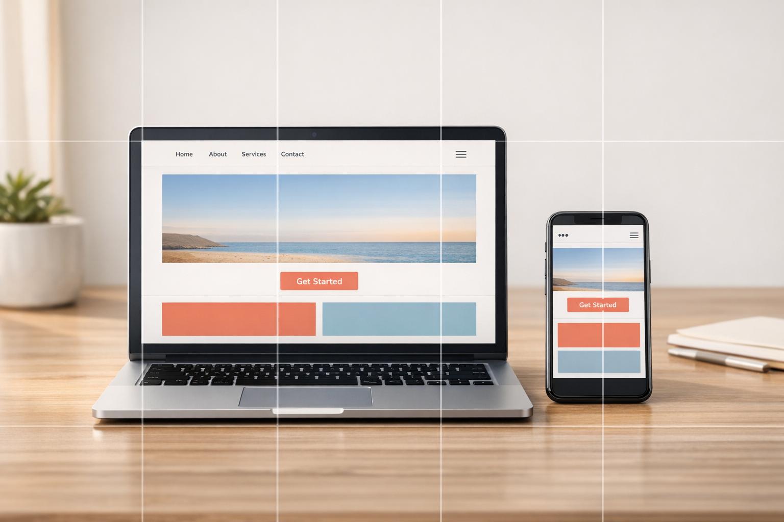
Subscribe to NewsletterBreakpoints in HubSpot CMS are screen width thresholds that adjust your website's layout for different devices, ensuring a better user experience across mobile, tablet, and desktop. These are set using CSS media queries in the theme.json file, with default support for mobile (max-width: 767px) and desktop. For broader flexibility, custom CSS can be used to cover additional ranges like tablets.
Here’s why breakpoints matter:
- Mobile-first design is critical as mobile devices account for 58.39% of global web traffic.
- Responsive websites improve usability, reduce bounce rates, and directly influence Google’s mobile-first indexing for search rankings.
- Poor mobile experiences can lead to lost leads and lower conversions, with 53% of users abandoning sites that take over 3 seconds to load.
Key Takeaways:
- HubSpot’s default breakpoints:
mobile(max-width: 767px) anddesktop. - Customize breakpoints in the
theme.jsonfile or with CSS for tablets and other screen sizes. - Use HubSpot’s drag-and-drop editor to tweak margins, padding, and visibility for specific devices.
- Test designs on real devices for accuracy, as browser emulators may miss issues.
Responsive design isn’t optional - it’s a necessity for better user engagement, higher conversions, and improved search rankings.
Mastering HubSpot CMS: Part 22 - Web Responsiveness Quality Check | QA | QC
sbb-itb-69c96d1
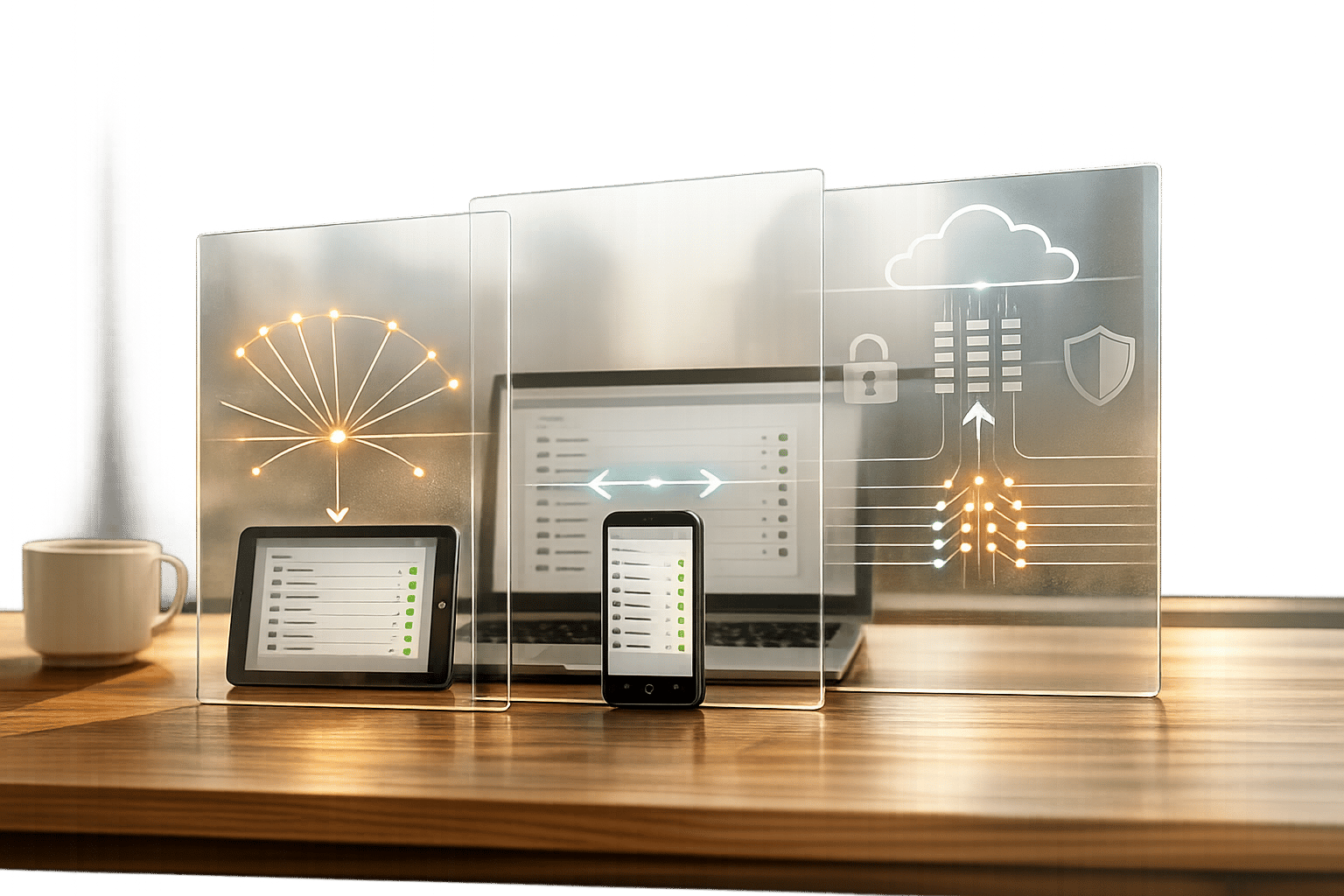
What Are Breakpoints in HubSpot CMS
HubSpot CMS Standard Breakpoint Ranges for Mobile, Tablet, and Desktop Devices
Breakpoint Definition
Breakpoints are predefined screen width values that determine how your website's layout and style adjust across different devices. They act as signals for CSS to rearrange elements, resize text, or hide certain modules based on the viewer's screen size.
In HubSpot CMS, these breakpoints are set in the themes.json file under the responsive_breakpoints object. This includes details like a name, a media query string, and a preview width. By default, HubSpot supports two main breakpoints for styling: mobile and default (desktop). These allow you to fine-tune styling in drag-and-drop areas - adjusting margins, padding, and visibility for sections, columns, and rows - depending on whether someone is viewing your site on a mobile device or a desktop.
Next, let’s explore why breakpoints are essential for creating a seamless user experience.
Why Breakpoints Matter
Breakpoints are crucial for ensuring your website is usable on all devices. Without them, your site might end up with distorted layouts or broken navigation, forcing users to pinch, zoom, or scroll awkwardly just to access basic content. For B2B SaaS companies, this can be a dealbreaker, often requiring expert technical consulting to resolve. Imagine a "Request a Demo" button that's cut off or a pricing table that's unreadable on a phone - issues like these can drive away potential leads. In fact, 34.6% of users will leave a site if it fails to provide a mobile-friendly experience.
Breakpoints address this by helping you prioritize content for different screen sizes. They ensure key information remains accessible even when elements stack vertically on smaller screens.
This becomes even more critical with Google’s mobile-first indexing. According to Google Search Central, "Google uses the mobile version of a site's content, crawled with the smartphone agent, for indexing and ranking". If your mobile layout is flawed, your search rankings could take a hit, no matter how polished your desktop site looks.
Understanding industry-standard screen ranges can help you design effectively within HubSpot's framework.
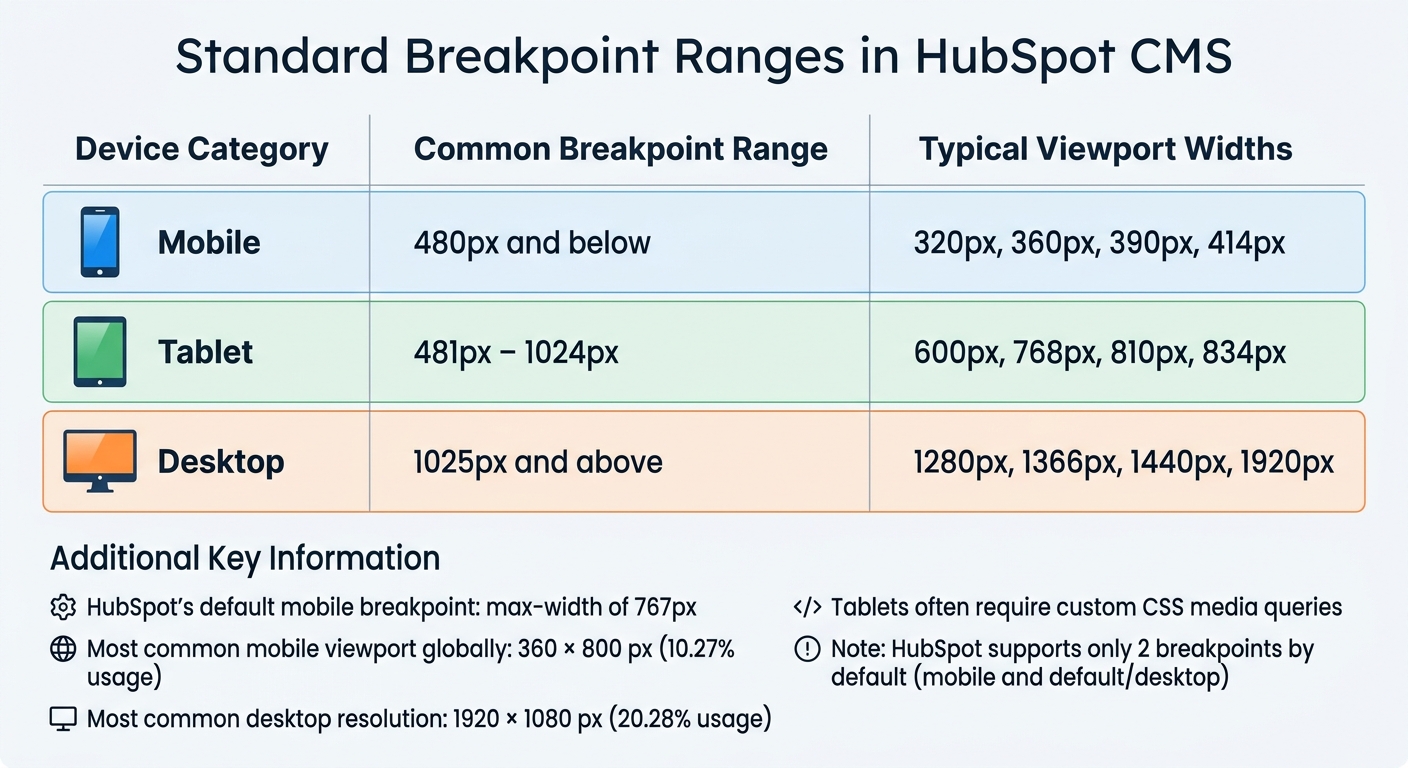
Standard Breakpoint Ranges in HubSpot CMS
Although HubSpot CMS primarily supports two breakpoints - mobile and default - industry best practices suggest designing for three key ranges:
| Device Category | Common Breakpoint Range | Typical Viewport Widths |
|---|---|---|
| Mobile | 480px and below | 320px, 360px, 390px, 414px |
| Tablet | 481px – 1024px | 600px, 768px, 810px, 834px |
| Desktop | 1025px and above | 1280px, 1366px, 1440px, 1920px |
HubSpot defines the mobile breakpoint as a max-width of 767px, which means tablets often fall under either mobile or desktop styles unless custom CSS media queries are applied. Globally, the most common mobile viewport is 360 × 800 px (10.27% of usage), while 1920 × 1080 px dominates desktop traffic at 20.28%.
To customize the mobile breakpoint, you can edit the theme's JSON file. However, keep in mind that HubSpot supports only one mobile breakpoint alongside default desktop styling. For more precise control, such as tablet-specific styles, you may need to create custom modules with fields tailored for various screen sizes. By understanding these ranges, you can go beyond HubSpot's defaults and deliver a design that feels responsive and polished on any device.
How to Configure Breakpoints in HubSpot CMS
Setting Up Global Breakpoints
Global breakpoints in HubSpot CMS are set in your theme's theme.json file under the responsive_breakpoints object. HubSpot supports two breakpoints: mobile and default.
To configure the mobile breakpoint, you'll need three key details:
name: This must be"mobile".mediaQuery: A string like"@media (max-width: 767px)".previewWidth: A value, such as 520 pixels, that defines the width used for mobile preview in the page editor.
This setup helps content editors see an accurate representation of how pages will appear on mobile devices.
HubSpot's responsive grid uses a 12-column Bootstrap 2 framework, where content rows stack vertically at 768px. If you need breakpoints beyond the defaults, you can override them in a child theme's CSS file. This ensures your customizations persist even when the parent theme updates. As HubSpot employee Jnix284 explains:
Once you overwrite them, the original media queries in the parent theme will be ignored.
Working with CSS Media Queries
To maintain consistent responsive behavior, apply media queries directly to your primary CSS stylesheet. For custom page-specific overrides, you can also include media queries in the <head> of a template using <style> tags. Rules defined at the page level will take priority.
Once your media queries are in place, assign CSS classes in the Design Manager or module HTML to activate the styles. For drag-and-drop areas (dnd_area), you can define responsive styles - like margins and padding - directly in HubL tags using a dictionary that specifies values for both default and mobile breakpoints.
Use clear, descriptive class names to minimize conflicts and test your media queries in browser developer tools to confirm they work as expected. After this, you can explore how the drag-and-drop editor simplifies breakpoint adjustments.
Adjusting Breakpoints in the Drag-and-Drop Editor
The drag-and-drop editor lets you fine-tune visibility, margins, and padding for the mobile breakpoint without altering the desktop layout. At the top of the content editor, you can switch between device views by selecting the corresponding device icon.
To hide a module or section on mobile, go to the Contents panel, select the element, expand the Visibility section, and choose Hide. For alignment and spacing, enter pixel values in the Alignment and spacing section while in mobile view. These settings will only apply to the mobile breakpoint. Use the "Apply to all sides" checkbox for consistent spacing across an element.
These tools work hand-in-hand with global CSS adjustments, offering a seamless way to manage responsive behavior in HubSpot CMS. If your theme doesn't support mobile editing, a developer can add the responsive_breakpoints object to the theme.json file with the name set to "mobile" and an appropriate mediaQuery, such as "@media (max-width: 767px)". By default, modules within a dnd_area allow adjustments for margins, padding, and visibility across breakpoints, while custom modules typically support visibility changes only.
Responsive Design Best Practices in HubSpot CMS
Mobile-First Design Approach
Designing with mobile screens in mind first ensures that the focus remains on the essentials. Starting with a smaller viewport, like 360px, naturally eliminates unnecessary elements and simplifies scaling up to larger screens. In contrast, adapting a desktop-first design for mobile often results in bloated code and a less-than-ideal user experience.
The stats tell the story: mobile devices accounted for 58.67% of global website traffic in the last quarter of 2023. Even more striking, 53% of mobile users will leave a site if it takes more than three seconds to load, and 88% are unlikely to return after a bad experience. Mike Funkhouser, Founder of Agency Helper, sums it up well:
"It is easier and more economical to scale up from a simple, mobile-optimized design to accommodate larger screens than to strip down a desktop-first design for mobile."
To get started, define your mobile breakpoint in your theme settings. Write your base CSS for mobile using relative units like rem, em, and %, which allow text and layouts to scale fluidly across devices. Leverage HubSpot's dnd_section, dnd_column, and dnd_row tags in HubL to set different margin and padding values for mobile and default breakpoints. This approach lays the groundwork for creating navigation and content strategies that adapt seamlessly across all devices.
Creating Consistent Navigation Across Devices
Once you’ve nailed the mobile-first foundation, the next step is crafting navigation that feels intuitive on any screen. Desktop users benefit from full horizontal menus, but these can waste space and reduce usability on mobile. For smaller screens, hamburger menus are a popular choice for viewports under 952px.
The Standard Menu module in HubSpot is a great tool for global headers and footers, offering features like flyouts and multiple orientations. HubSpot also applies CSS classes like .active-branch and .active to menu items, helping users see their current location regardless of device. For more complex headers, consider creating two sections in your global partial - one for desktop and one for mobile - then use CSS media queries with display: none and display: block to toggle between them. Don’t forget to include a "skip to content" link in your header to make navigation easier for keyboard users.
Prioritizing Content for Different Screen Sizes
Effective content prioritization ensures your most important information shines on any screen size. Mobile screens, in particular, require thoughtful adjustments. A three-column desktop layout often needs to stack vertically on smaller devices, with critical elements placed above the fold.
HubSpot’s drag-and-drop editor allows you to toggle module visibility based on the device type. This means you can hide less important content, decorative elements, or redundant calls-to-action on mobile while displaying them on desktop. Keep the focus on key information without entirely removing supplementary details. For typography, set a root font size (commonly 16px) and use rem units to ensure consistent scaling. Lastly, make sure buttons and links are large enough for touch interactions - cramped designs can frustrate users and drive them away.
Testing Breakpoints in HubSpot CMS
Using HubSpot's Preview Tools
HubSpot offers built-in preview tools that make it easy to see how your pages look on various screen sizes. To get started, head to Marketing > Files and Templates > Design Tools, select your template, and click Preview. When you choose Live preview with display options, you can test responsiveness within an iframe and even set specific viewport dimensions for a more tailored check.
The content editor also includes handy device toggles at the top of the screen. Simply click the Mobile or Desktop icons to see how your page adjusts to different devices. For a deeper dive, you can add ?testmode=true to the URL in the theme editor. This allows you to safely test theme fields and styles without affecting your live site.
However, it's worth noting that HubSpot's internal mobile preview isn't entirely precise. As Anton, a prominent voice in the HubSpot Community, points out:
The mobile preview inside HubSpot might not be 100% accurate. Best practise is using something like browserstack... a real device or at least the mobile preview of the browser.
While these tools are great for initial checks, real device testing is crucial to catch issues that emulators might miss. Always follow up by testing your site on actual devices.
Testing on Real Devices
Browser tools are helpful, but they can’t fully replace testing on real devices. Physical devices reveal issues like spacing problems, touch responsiveness, and font rendering quirks that emulators often overlook. Considering that more than half of global internet activity happens on mobile devices and Google prioritizes mobile-first indexing, this step is critical.
Focus on devices that reflect the most common viewports for your audience. Be sure to test in both landscape and portrait orientations, especially on tablets where layout shifts can occur.
Check that touch targets are at least 48 pixels wide and tall to make tapping easy. Confirm that your hamburger menu works correctly at mobile breakpoints, and use a minimum base font size of 16 CSS pixels to ensure text remains readable without zooming.
Responsive Design Testing Checklist
Once you've tested on devices, use this checklist to catch any remaining issues:
- Navigation: Ensure your hamburger menu triggers at the correct breakpoint and that links are easy to tap without accidentally clicking nearby elements. Verify that desktop menus transition smoothly to mobile layouts.
- Forms: Check that labels and input fields are clearly visible with proper contrast. Avoid "white-on-white" text problems.
- Images: Make sure images are sharp and optimized for each device size. For example, serve a 320-pixel image for mobile and a larger version for desktops to prevent slow load times.
- Typography: Use relative units like rem or em so text scales properly and stays readable across all breakpoints.
- Layout Elements: Test padding, margins, and column stacking on mobile. Ensure hidden modules don’t leave awkward gaps. Also, check that fixed headers don’t block interactive elements.
For debugging, add ?hsDebug=true to your live page URL to view non-minified files and rendering details. You can also use ?developerMode=true in the page editor to access advanced features. These tools can be invaluable for ironing out the finer details of your responsive design.
Optimizing Media and Content for Breakpoints
Once you've refined your breakpoints and layout settings, the next step is to optimize your media and content. This ensures your site looks great and loads quickly, no matter the device.
Image Optimization Across Breakpoints
HubSpot CMS simplifies image delivery by using a CDN to serve WebP formats and minify files automatically. Still, there are additional steps you can take to enhance image performance across devices.
- Compress images before uploading using tools like Tiny PNG.
- Define height and width attributes in your HTML to reserve space and prevent layout shifts (CLS). This also enables automatic
srcsetgeneration. - For background images, use media queries with
resize_image_url()to serve device-specific sizes.
In the HubSpot image module, selecting "Automatically adjust" ensures images scale appropriately for each device. You can also choose image resolutions - High, Default, or Low - based on your page's requirements. To improve initial page speed, apply lazy loading for below-the-fold images, but set hero images to "Eager" loading so they display immediately.
As Emily Davidson, a HubSpot CMS Developer, explains:
A faster site equals higher quality conversions.
This is backed by data: pages that load in 1 second have a conversion rate 2.5 times higher than those that take 5 seconds.
For graphics that need to stay sharp at any size, opt for SVG files instead of raster formats. SVGs maintain their quality regardless of scaling while keeping file sizes small. Additionally, include img { max-width: 100%; height: auto; } in your stylesheet to prevent images from overflowing their containers on smaller screens.
Adjusting Typography and Spacing
Typography plays a big role in readability and maintaining a clear visual hierarchy. Use relative units like rem or em so text adjusts fluidly across different devices. Google suggests a minimum base font size of 16 CSS pixels for readability on all screens.
For smooth scaling between breakpoints, combine viewport units with rem using the CSS calc() function - for example, font-size: calc(1rem + 1vw). This prevents abrupt size changes and ensures text remains legible. Adjust headings (like <h2>) to stay prominent on desktop while fitting comfortably on mobile.
Interactive elements should be at least 48px by 48px to accommodate touch targets. Simplify navigation menus for mobile to reduce clutter and enhance usability. If you're using HubSpot CMS, HubL tags within dnd_section, dnd_row, and dnd_column allow you to define padding and margins for both desktop and mobile views.
Once typography is optimized, it's easier to balance text and visuals for effective communication.
Managing Image-to-Content Ratios
Optimizing layouts for different devices also means managing the ratio of images to content. Aim for a 60:40 balance between text and images for visually appealing layouts. On smaller screens, focus on essential information by stacking or rearranging content. For example, move non-essential images below key content to maintain conversion paths.
Use relative units like percentages, vw, or rem instead of fixed pixels. This ensures text and image containers scale proportionally across viewports. For background images in custom modules, media queries can serve resized images tailored to desktop, tablet, and mobile dimensions. As Jonathan Pavoni, CEO of Creatrix Marketing, notes:
This technique [media queries for images] will ensure that your images look crisp at every dimension, and it will also make sure that your page load times aren't extended because you're bringing in an unnecessarily large image file.
With mobile devices making up 58.67% of global web traffic by the end of 2023, and 34.6% of users leaving sites that lack mobile-friendly content structures, getting these ratios right is crucial for keeping visitors engaged.
Summary
HubSpot CMS supports two main breakpoints - mobile and default (desktop) - which are set through the responsive_breakpoints object in your themes.json file. While these cover most scenarios, custom CSS media queries are necessary for handling specific cases like tablets or ultra-wide screens. The drag-and-drop editor also allows you to fine-tune padding and margins for mobile and desktop using HubL tags such as dnd_section, dnd_row, and dnd_column.
A mobile-first approach is key to effective breakpoint implementation, especially when mobile devices now drive 58.39% of global web traffic. Clinton Joy from HubSpot Blog highlights this shift, stating: "Responsive design isn’t just a 'nice-to-have' - it’s the baseline for building anything online in 2025". Additionally, with Google’s mobile-first indexing, your mobile site directly influences search rankings.
Testing is essential to ensure your site functions well across devices. HubSpot’s preview tools and the ?testmode=true URL parameter are great for initial checks in the theme editor. However, real-device testing is equally important to identify issues like touch-target accuracy and font rendering that browser tools might miss. Focus on the most common resolutions, such as 360 × 800 px for mobile (10.27% of global traffic) and 1920 × 1080 px for desktop (20.28% of traffic).
Optimization plays a crucial role in creating a high-performing site. Use relative units like rem and em for typography and serve device-specific images with media queries. For B2B SaaS companies, this can lead to improved lead generation and stronger customer trust, especially since 88% of users won’t return after a poor experience.
FAQs
Can HubSpot CMS support tablet-specific breakpoints?
HubSpot CMS does support tablet-specific breakpoints, enabling developers to apply unique styles for tablets, distinct from mobile and desktop. However, the platform primarily offers two breakpoints: mobile and default (desktop). Developers can still adjust styles within these parameters to create responsive designs that work seamlessly across various devices.
Will changing the mobile breakpoint in theme.json break existing layouts?
Changing the mobile breakpoint in theme.json can be done without disrupting existing layouts, provided it's configured carefully. This adjustment lets you set up responsive styles tailored for both mobile and desktop views. However, if not configured correctly, it might cause layout inconsistencies. To avoid this, thoroughly test and fine-tune all styles to ensure they look consistent across different devices.
What’s the fastest way to test breakpoints on real devices?
Responsive testing tools are your go-to solution for checking breakpoints on real devices. These tools go beyond the limitations of resizing a browser window, helping you catch layout problems that might otherwise slip through the cracks. Platforms like BrowserStack let you test your website’s responsiveness on actual devices, ensuring it performs well across a range of screen sizes. Testing on real hardware is crucial for achieving precise and reliable results.